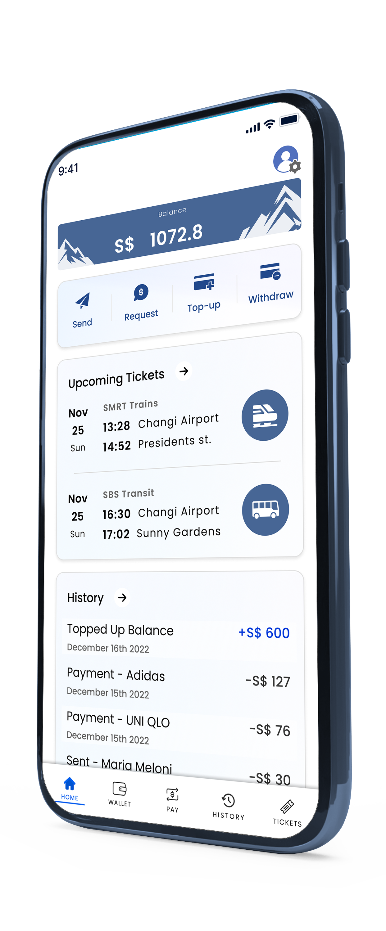

Imagine being in a foreign country, excited to explore, but you can't even pay for basic services without jumping through hoops. Non-residents in Asia struggle to connect to local instant payment networks. While locals are using platforms like WeChat, and Line, Westerners find themselves disconnected from systems they can't reach or don't understand.
Our team saw an opportunity to change this. Pinnacle Pay was designed to bridge between Western users and the payment systems of Asia. We wanted users to make the transition seamless. We studied the apps they already used and loved, borrowing their strengths, eliminating weaknesses and spotting opportunities.


But trust isn't easily earned, especially when money is on the line. Many users had been burned before - frauds, unhelpful customer service, and feeling powerless. How could we convince them Pinnacle Pay was different? The design challenge was clear: create a platform that projected positivity, and felt secure and reliable, while maintaining ease of use.
We built credit systems that encouraged and reinforced minor interactions. We added multiple layers of security without burdening the user. And, we made customer support a central feature, ensuring there was always someone on the other end. The groundwork was laid, the design was solid, and the solution was poised to help tens of thousands per year, but fundraising efforts fell short. In the end, Pinnacle Pay had to be shelved - but the journey taught us invaluable lessons about trust, design, and perseverance in the face of financial hurdles.

Through my research, I discovered that people have concerns about payment applications but can be persuaded in several ways:
Cash-back options and discounts have proven enough to convince hesitant to try an app for the first time.
Turning many steps of the user journey into chances to earn credits, translatable into benefits is a successful way to make a boring app engaging and to reward people for using it.
Social norms are often enough to turn non users into users, given people around them are using an app they will likely try it too.
Social proof such as recognizable brand names is helpful too.
Lastly, providing a useful client service and multiple security measures is highly beneficial.
I discover my users largely fall into two groups, those who seek to minimize costs in the form of currency exchange or benefits, and those who seek facility. Theses laid out the framework for my personas and journey maps.
I conducted a competitive analysis to understand where similar products excel and fall short, which helped me identify opportunities to differentiate our solution and meet unmet user needs.
see more
By performing user research, I gathered valuable insights directly from potential users, which shaped my understanding of their pain points, motivations, and how the product could best serve them.
see more
I created user personas to embody key user archetypes, ensuring the design decisions aligned with the specific goals, behaviors, and challenges of our target audience.
see more
The user journey map allowed me to visualize the full experience from the user's perspective, uncovering pain points and highlighting areas for improving the flow and engagement.
see more
I developed user flows to clearly define the steps users would take to complete core tasks, ensuring the product fulfills users' needs.
see more
Book a first session or inquire about possible collaborations

+33 0760-29-39-91

tomer@rozedesign.com