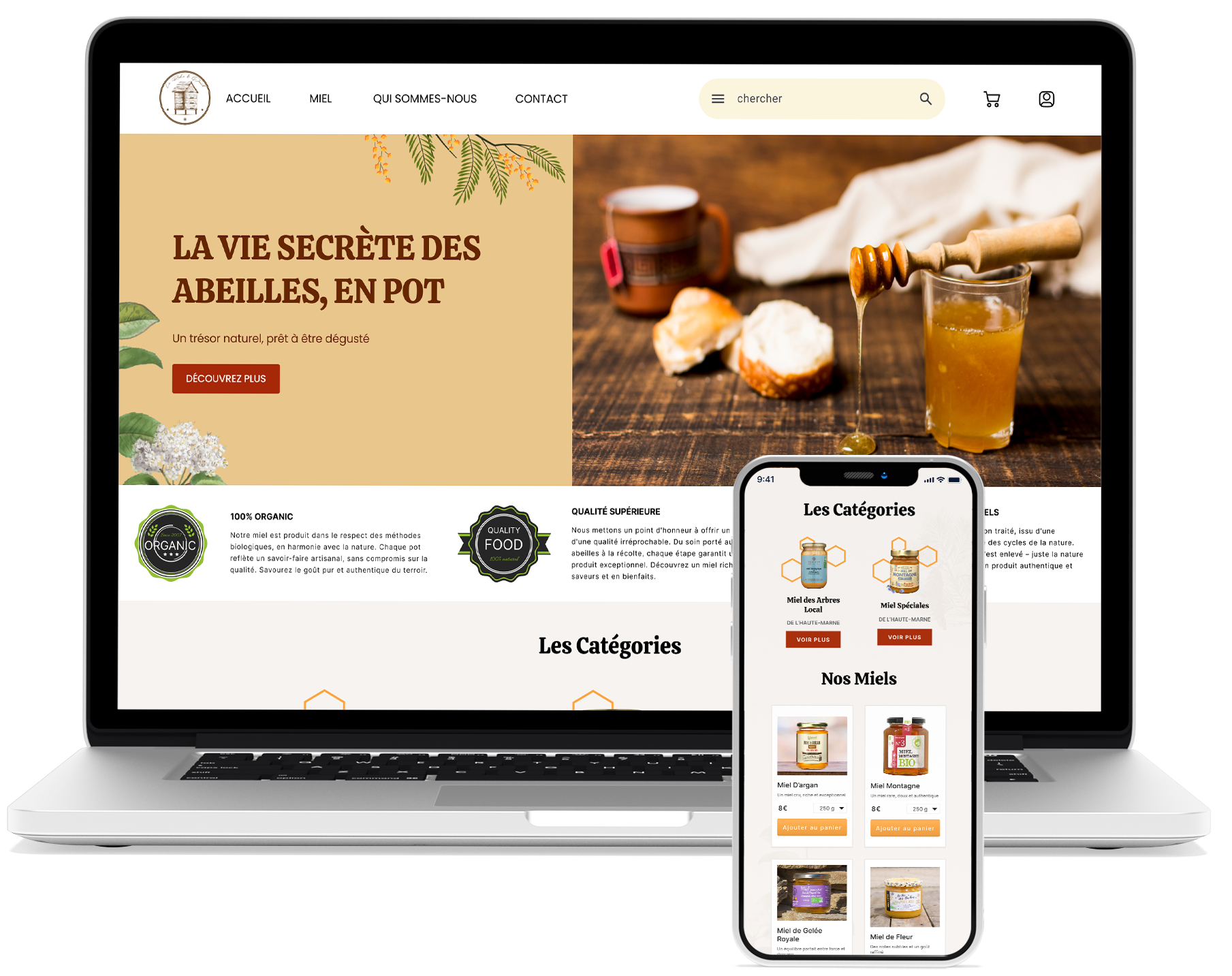
La Ruche de David is a family-owned honey business in the Haute Marne region of France. David contacted me, wishing to explore the possibility of an e-commerce website that could preserve the business' authenticity while reaching a broader audience and potentially increasing sales revenues.
As the project took shape, I realized it was more than just designing a website. The real challenge was far greater—I had to build an entire e-commerce platform using a no-code tool, something I'd never done before. All the while creating product labels and a brand identity David can feel proud of. On top of that, I had to figure out the intricacies of online payments systems and deliveries, both of which were entirely new to me. Each step felt like uncharted territory, pushing me beyond the role of a typical designer.

The only way forward was to dive in. I spent countless hours watching tutorials, reading experts, and testing everything until I found the right mixture of solutions. It was a steep learning curve, but by experimenting and refining each step, I successfully turned a raw idea into a fully functioning e-commerce site that looked as good as it performed.
The outcome exceeded expectations. Not only did the website stay true to David's business's rustic charm, but it also opened the door to a new audience. In just three months, sales nearly doubled, and the brand's reach expanded far beyond the local market. By combining design with the right digital tools, I helped La Ruche de David take a bold step into the future without losing the essence of its past.
By sketching some interactions and user journeys, I came up with the most fundamental operations our users will execute. With that in mind, I turned to generating a sitemap serving as the site's skeleton.
While ideating some lo-fi sketches of the site I started working on the Mood Board. I called David and learned of his values, the love for his family, country, and the nature around him. That call helped me to design a brand that shows a connection to the land, showing local vegetation and historic monuments, and using colors and typography that convey these messages.
To enhance accessibility, I adhered to AAA contrast standards, ensuring the site was optimized for the visually impaired. I also took care to avoid relying solely on color to convey important information, ensuring all users would have a smooth, inclusive experience.
Additionally, I integrated sales-boosting features, such as free shipping thresholds paired with a progress bar indicating how close the customer was to qualifying for free shipping, among other techniques aimed at driving conversions.
Having turned my designs into fully responsive functioning website using Web flow I tested, fixed, and educated my client on the Platform.
Once all was set and done, we launched, and let the magic happen.
I developed user flows to clearly define the steps users would take to complete core tasks, ensuring the product fulfills users' needs.
The sitemap gives us an idea of the project's framework and scope—how many pages, which functionalities, and what the structure is.
All apps and websites communicate their identity using a combination of design principles, colors, and typography. The mood board portrays how we will convey the project's identity and message.
Book a first session or inquire about possible collaborations

+33 0760-29-39-91

tomer@rozedesign.com